Left-Brain Creativity Drives Continuous Improvement
Because Left-Brain Creativity and the desire to continuously improve drives us at Williams Randall Advertising, our work for a client is never truly done. That’s especially true where websites are concerned because as technology, business goals, and user expectations evolve, web pages can continually be re-evaluated and optimized to perform even better for users and our clients.
For Elements Financial, we recently redesigned the product pages on their website, elements.org, based on insights gained from usability interviews with site users and by studying interactions and conversion performance on product campaign landing pages. The research revealed two important insights to address:
1. One design element (a tabbed content area spanning the width of the page) was preventing users from scrolling down to important conversion content;
2. While the site featured more product information than ever before, some users still felt they needed more specifics before taking action.
In addition, we sought to increase the relevancy and personalization of contact information and special offers shown on the page based on known user characteristics and past browsing behavior.
Optimizing Product Detail Pages
Elements works hard to help their credit union members enjoy financial wellness and success, so they put a big emphasis on education and making informed financial decisions. So as you can imagine, more than half of the pages on elements.org are informational pages about its products and services. When we first redesigned the site back in 2017, scope allowed for the design of just one CMS (content management system) page template for product pages. We made it work — and successfully improved the engagement and application rate on product pages. Still, we knew in the future additional customization could optimize performance of these important sales pages even further.
The future came in 2020.
Building Pages with Flexible Content Sections
The tabbed content area that deterred users from scrolling is now a thing of the past, and the new product detail pages no longer rely on a single structured template; instead, they are built with a highly flexible set of seven CMS content “widgets.” Each widget, or section, provides a different set of features — such as an image gallery, a customer quote, an FAQ block, or a calculator — and the sections can be arranged in custom ways for each unique product. The breadth of options allows for each product page to be completely customized, allowing business goals and user needs to mesh seamlessly.
The scrolling image below illustrates how the optimized Elements Signature Rewards Visa page utilizes many of the new custom CMS content sections, making the page more scannable, relevant and — most important — effective. Read on for even more details after you check out the image below.

Introducing Personalized Special Offers, Events and Contact Information
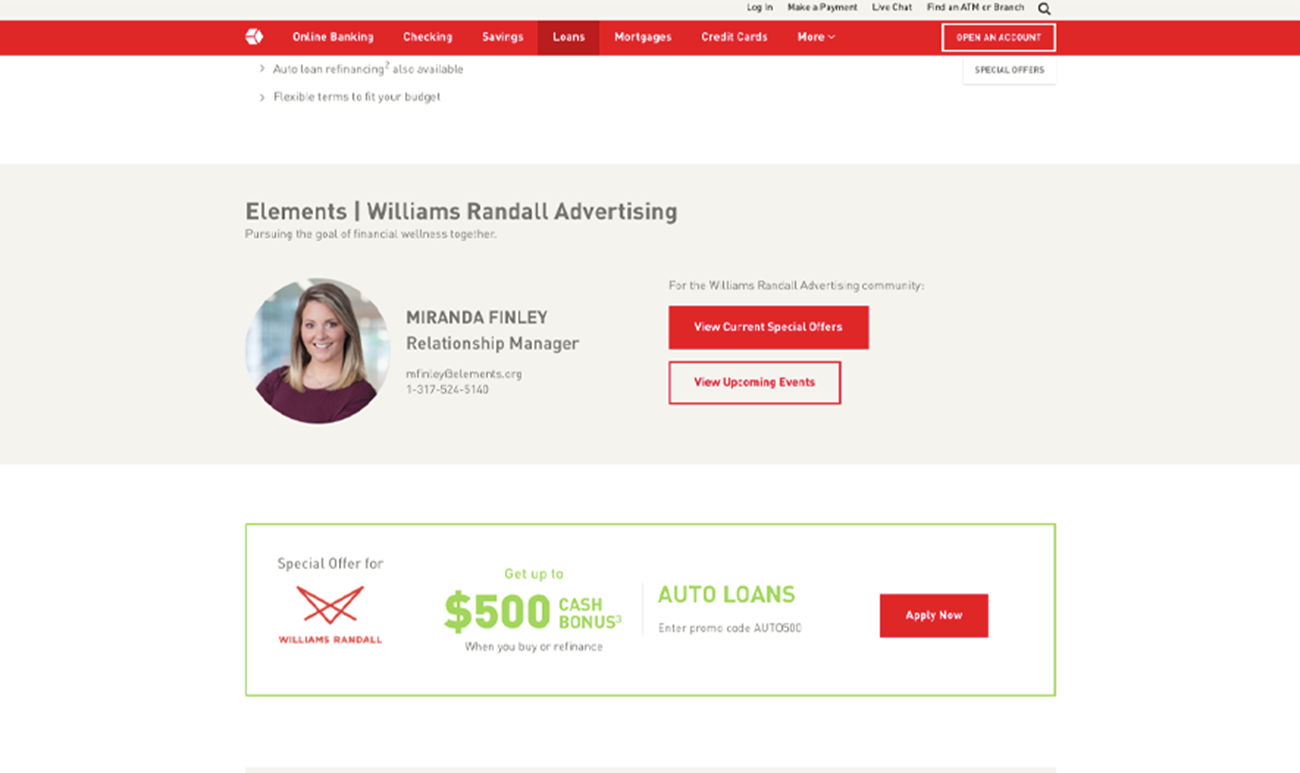
Another major component of optimizing the product pages was introducing personalized special offers (e.g., “Get a $500 cash bonus”), upcoming events, and contact information (e.g., the direct email for Miranda, the personal Elements Relationship Manager assigned to your company) based on their member profile and past site interactions. This personalized approach to the website experience matches the Elements experience that member companies already have through emails, in-person programs and more. So now, when an Elements customer visits the website, they will see the same special offer or upcoming webinar that they may have been told about in an email from their Relationship Manager, making the experience feel more connected and relevant.
-
 Product pages can now include special offers, upcoming events, and contact information customized to the site visitor’s profile. Above, you can see a product page with content personalization.

Continually evaluating the effectiveness of our work lets us always be on the lookout for ways to improve our clients’ results. And the big winner here is the user base of elements.org.


