At Williams Randall, we are firmly committed to continuous improvement. When we build a new website for a client, we take into consideration all we’ve learned from research with users as well as insights from past site performance. We use that information to build new interfaces, but we never “launch it and forget it.” With every website design there's potential for future iteration. We install tracking mechanisms to measure the performance against goals and we follow up with quantitative and qualitative user research, such as user surveys and interviews, to ensure our content and design choices are meeting the mark.
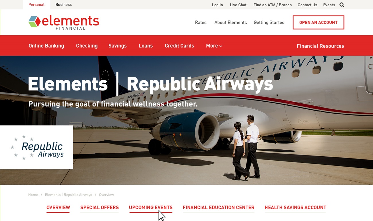
It’s through this process that we recently uncovered a potential area for improvement on certain pages of the Elements Financial website. During usability interviews, we discovered that users were visually overlooking the secondary, in-page-navigation that we had implemented and consequently missing important pages of content. Google Analytics usage data also revealed that users were not engaging with the sub-navigation as often as we would have hoped.
-
 Before: Tabbed Secondary Navigation

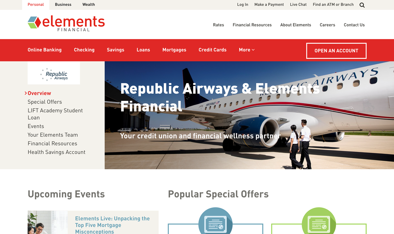
We set out to solve this problem by testing out a new variation of secondary navigation in one of the site’s sections. We selected Element's personalized partner pages to run a test. These personalized sections act like a site within a site, and if customers miss all the sub-pages in the section, their information needs are not met and potential revenue is lost. To tackle this issue, we explored different locations and styling for the secondary navigation and settled on a new placement to the left of the hero image—higher up on the page, more visually prominent, and separated from the page’s main content area. If this change helped increase engagement with the sub-navigation, our plan was to roll out this new strategy to other pages of the site.
-
 After: Secondary Navigation in Hero Area

The results are in and they’re exciting! Comparing engagement with the old sub-navigation to the new, we saw a +30% increase in navigation clicks since the launch of the new design! That means users are clicking on the sub-pages of the personalized partner pages 30% more than they were previously, exposing them to additional educational content and conversion opportunities. These positive results give us confidence to roll out the new style to the remaining pages of the site. And since Williams Randall is all about continuous improvement, you know we’ll be keeping an eye on how the changes impact performance as well as looking for entirely new ways to improve the site.


