Volunteer Event Leads to Rebrand and Website Redesign
Williams Randall plans a service event for our staff at least once a quarter, and in April of last year, we volunteered with the Indiana Diaper Bank—a nonprofit organization that provides free diapering essentials to families and babies in need. We invited some of our clients along and spent a fun and productive afternoon organizing and packaging diapers. What we didn’t know at the time, was how much our partnership would extend beyond that one volunteering session.
Forming a New Partnership
Turns out, Indiana Diaper Bank needed to update its website and asked Williams Randall if we would consider helping them out in that way as well. We wholeheartedly support the Diaper Bank mission—which is to reduce diaper need in Indiana, where 1 in 3 families struggle to afford diapers—and happily agreed to help.
Rebranding to Reflect Their Mission
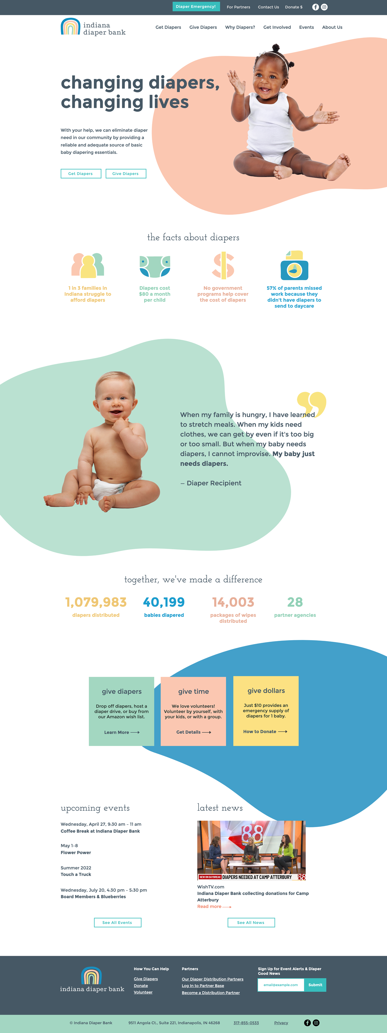
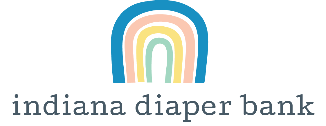
When we started discovery sessions to determine the goals for the new site, it became clear that the existing Indiana Diaper Bank logo and brand weren’t adequately conveying its mission or story. So, we began our partnership by creating a new logo, color palette, and brand style that would truly reflect the approachable, hopeful, trustworthy, and community-focused nature of their organization. The new logo is based on the hope Indiana Diaper Bank provides to families in difficult times—the rainbow after the storm. The hand-drawn look of the rainbow gives it a playful, child-like quality and the shape also resembles a crawling baby bottom. The new brand uses slightly muted, but playful, gender-neutral colors, hand-drawn icons, organic shapes, and photography of adorable, happy babies—which is what Indiana Diaper Bank is all about!
A Website That Tells a Story
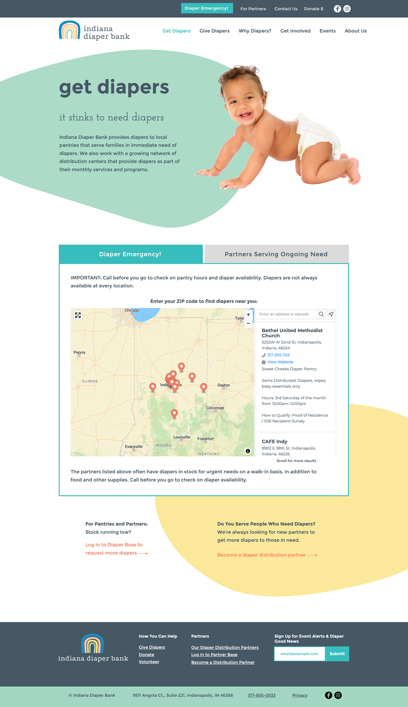
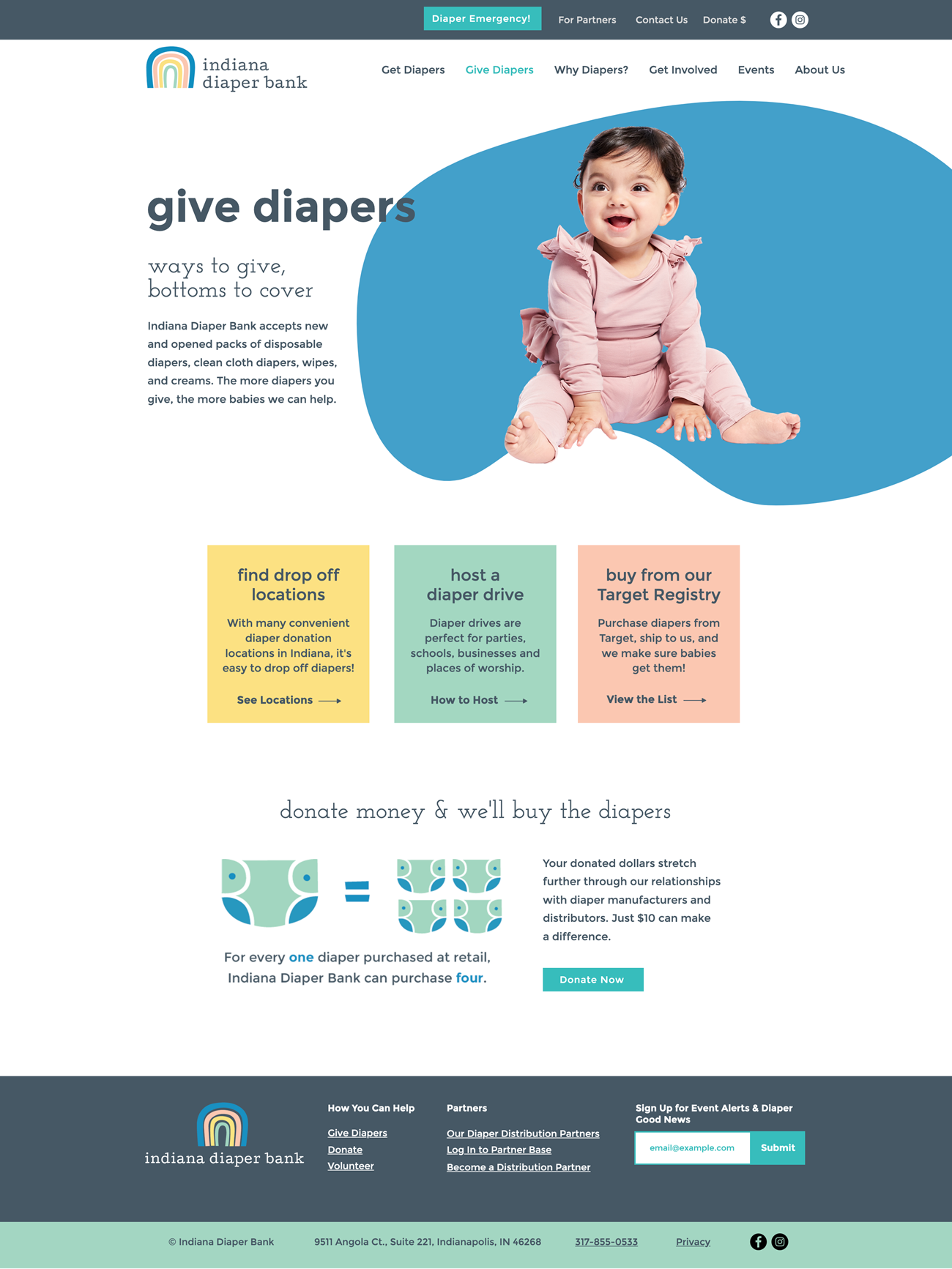
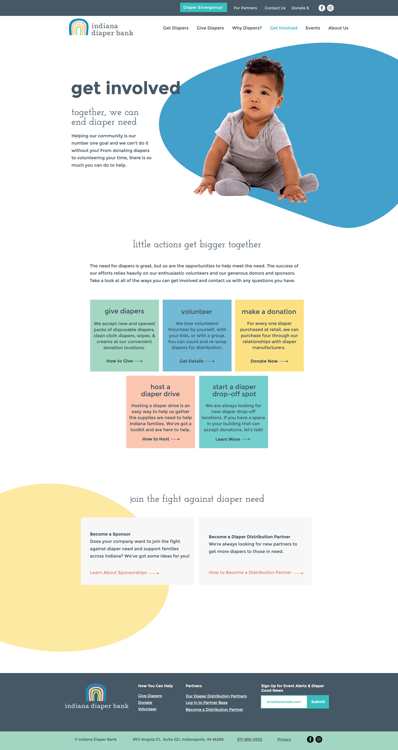
Once we had established the new brand look and feel, we began work on a new website that would be easy to navigate, have a clean design with plenty of white space, and share impactful storytelling. We focused the design of the new site on four key strategy points: communicate their mission, connect families with places to get diapers, encourage visitors to donate or get involved, and demonstrate Indiana Diaper Bank’s impact as an organization. The new homepage meets all of those key goals by using icons to educate the audience about diaper need, displaying prominent calls to action that allow users to self-select from multiple ways to get involved, and demonstrating the impact of the organization through quotes from diaper recipients and stats that call out everything from the number of diapers distributed (over one million!) to the number of babies helped.

Content Organized Around User Needs
Other key components of the site redesign included an overhauled sitemap, a way to easily update content, and integrations with existing platforms. The new site architecture organizes content into high-level sections based on what a user hopes to accomplish—whether that be getting diapers, giving diapers, getting involved, or learning about Indiana Diaper Bank and why they do what they do. We also set up a content management process where news, events, and even those ever-growing stats can be updated all in one place. Events are connected to the Diaper Bank’s Eventbrite page and their donation and email management tool, Aplos, is integrated for continued use.
Our client is thrilled with the new site, and we are so honored to play a small part in supporting their efforts to end diaper need in Indiana, leading to healthier, happier babies and families.
You are brilliant. The work you have done is beautiful. We are so in love and we can't say THANK YOU enough!
Project Bonus: Exploring a New Tool
This pro bono project also provided us the perfect opportunity to test out the use of web building platforms to create small, cost-efficient sites that don’t require custom programming time—which we have been exploring as a potential agency service line (our usual specialty is large, highly complex, custom websites). After researching various platforms, we chose Wix for its ease of use, design-friendly interface, and low subscription costs. Throughout the process, we learned that, despite some limitations, we could create a beautiful, custom-designed website for a relatively low cost. Since this project began, we’ve also used Wix as a tool to quickly build lead-generation landing pages for our own agency campaigns.

